
As promised in one of the previous blog posts dedicated to the West Balkans DLC, we’d now like to showcase concepts of several industry brands created for this map expansion by two of our very talented graphic designers.
Specifically, we sat down with Karina and Adel and asked them about their motivations behind creating the brands. We hope you will enjoy reading their thoughts about the way the companies will be visually represented.


Furniture factory - JASTUK (Karina)
JASTUK, a furniture factory, will expand its presence in the Balkan countries. Since the name "Jastuk" means "pillow," I focused on incorporating pillow shapes during the logo design process.
Initially, I envisioned JASTUK as a playful brand that aims to evoke friendly associations and build trust with customers looking to furnish their homes. As you can see in the logo versions, there are fun pillow shapes, and dots have been added to the letter "U" to create the appearance of a smiling face. The first logo versions used a yellow and purple color palette.
However, I later opted for a completely different approach, giving JASTUK a luxurious touch. I switched to a monochromatic color scheme and chose an elegant font. That's when I realized JASTUK should exude gracefulness and a calming vibe rather than playfulness and vibrancy.


River port - Luka DunaVia (Karina)
This river port was specifically created for the West Balkans DLC. During the design process, my focus was mainly on giving this company a modern, premium, and simple feel. I chose a geometric sans-serif typeface for the company name and then played with the shapes of a boat and waves, as they are associated with river ports.
For the desired associations, a minimalistic approach seemed to be the best choice. Therefore, I stuck with one color to embrace the overall simplicity. The minimalistic style follows the principle of 'less is more,' which is why the boat and waves are represented as abstract forms made of lines.
The version that incorporates white space for the waves appeared to be the clearest and most eye-catching one. Of course, I couldn't resist incorporating this wave element into the totem of the river port as well. I hope you will enjoy the luxury and unique atmosphere of Luka DunaVia river port!


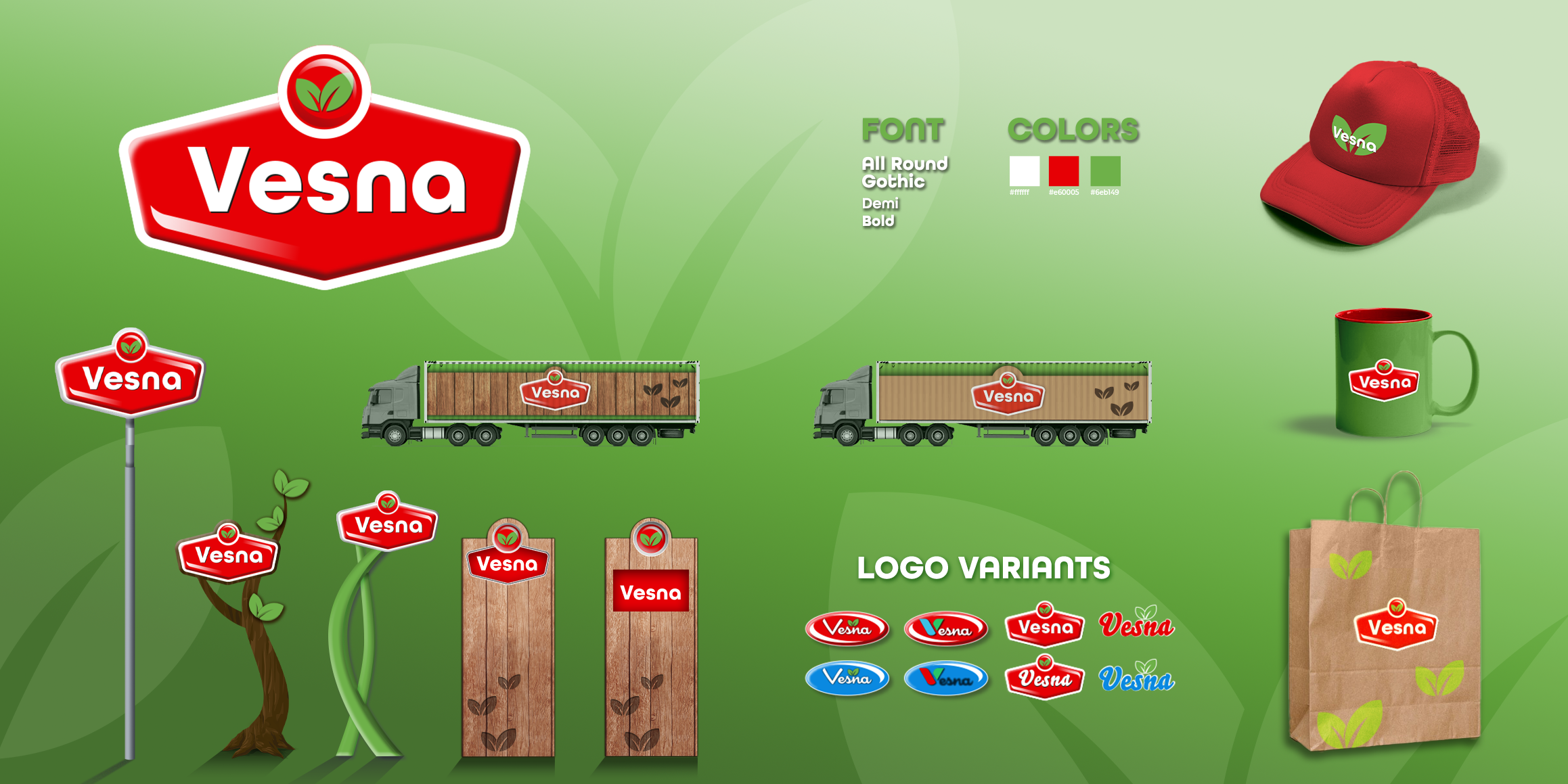
Food processing - Vesna (Karina)
Vesna, the food processing company in the Balkans, emerged as a brand with a long-standing history in the business. For its design, we aimed to evoke a sense of happy nostalgia, reminiscent of childhood, sweets, and family moments.
The intentionally designed logo features gradients, strokes, and various shapes that may appear outdated in the world of modern graphics. However, this was precisely the effect we wanted to achieve. As Vesna is associated with food, the logo needed to convey a friendly and ecological appearance, characteristic of many food chain companies. To accomplish this, we used a rounded and clean font for the name and incorporated leaf elements to establish a natural and ecological connection with the brand.


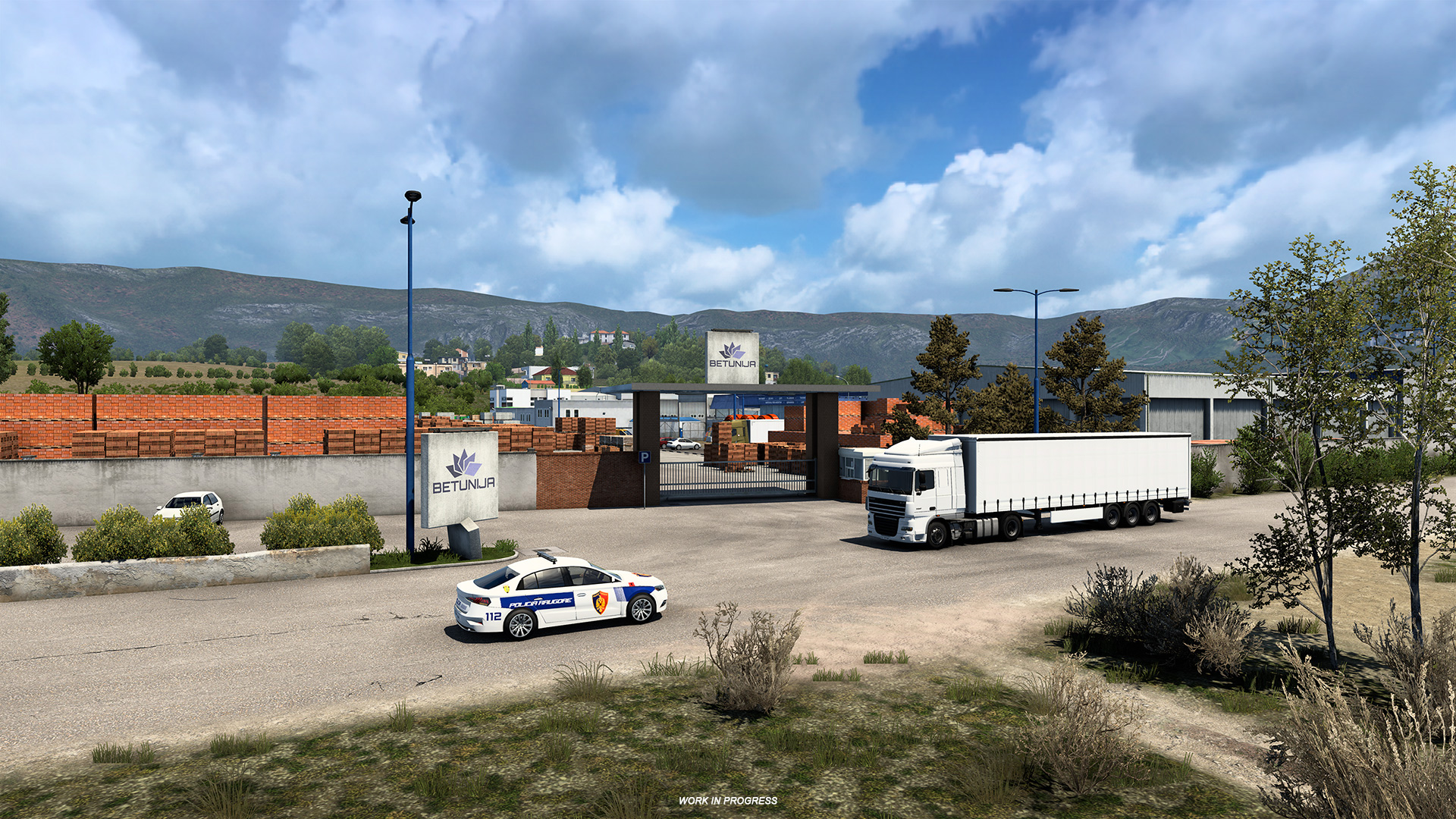
Building material storage - BETUNIJA (Karina)
The name of the building material storage was created by combining the word 'beton,' which stands for concrete, with the petunia flower, known as 'petunija' in some Balkan languages. Combining two elements with such contrasting vibes into one logo was not an easy task, so I'm eager to hear your feedback on the final result.
Firstly, I focused on associations related to the construction industry, as this is the area of BETUNIJA's expertise. To convey a sense of brutalism and masculinity, I selected a square geometric sans-serif font, which evokes feelings of stability, persistence, and strength. The color palette was determined based on the common color of petunias, which is purple. The petunia shape itself serves as the main symbol in the logo, but it has been modified into an abstract, angular, and even sharp form to avoid any feminine connotations. The 'flower petals' in the logo also function as symbols representing color maps commonly found in building materials shops.

Sawmill - CRNO DRVO (Karina)
The sawmill CRNO RDVO, which literally means 'black wood,' can be found in Montenegro. While browsing the internet for logo inspiration, I noticed that the most common symbols used were a saw, fir tree, or an axe, and that was it. However, I wanted to take a more original approach by focusing on the wood itself, specifically the shape of a log. My goal was to create a cool brand that takes pride in its work and wants to showcase it to the world.
To achieve this, I carefully selected a black and yellow color combination. Black is a timeless color that transcends trends and conveys power, formality, and prestige. Yellow, on the other hand, evokes feelings of joy and happiness and serves as an attention-grabbing accent color. For the logo's font, I opted for simplicity, with lines that often remain unconnected, mirroring the natural patterns found inside a wood log.


Vehicle Company - Larus (Adel)
The process of creating the "Larus" logo proved to be quite challenging and engaging. I spent a lot of time experimenting with different ideas and variations. Each logo concept was meticulously crafted to capture the essence of the company. “Larus” means "seagull". For that company, it symbolizes a connection with nature and imbues the company's vehicles with grace and lightness.
During the logo development process, I engaged in numerous discussions with my team lead, so we aimed to create a design that would leave an impression on players. In the picture, you can see variations of this logo and the end result that was finally approved.


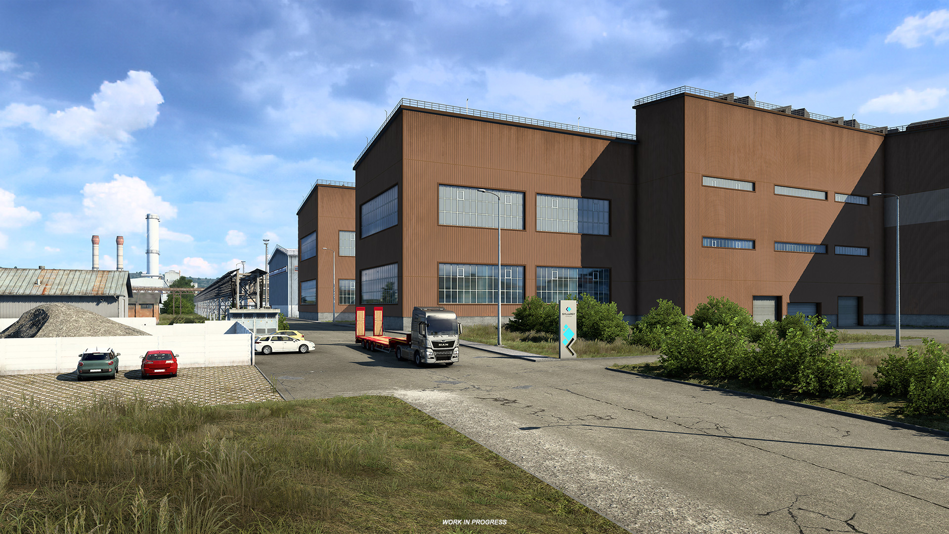
Heavy Industry - Syllurgy (Adel)
When creating the logo for the company "Syllurgy” which operates in heavy industry, aimed to convey a futuristic appearance and visually represent the concept of energy. The initial idea revolved around the notion of movement and dynamics, so I considered using a rotating circle as the main illustrative element.
However, during the logo development process, I decided to change the concept and visualize the idea using two pieces of metal that complement each other. This approach creates an impression of strength and stability while embodying the importance of interaction and interconnectedness within the field of heavy industry.
Overall, the "Syllurgy” logo with two complementary pieces of metal represents a strong and dynamic symbol embodying the energy and interaction characteristic of a company operating in the heavy industry sector.


Supermarket Chain - Villco (Adel)
When designing the logo for the "Villco" hypermarket chain, my goal was to create a friendly design that would reflect the enjoyable experience of a family trip for groceries. I wanted the logo to evoke feelings of warmth, and comfort, and invite customers to a positive shopping experience.
One of the key elements of the logo is the yellow circle positioned at the right corner. It symbolizes a rising sun, inviting customers to visit the hypermarket in the morning and start their day with a bright and positive shopping trip. This element also represents the idea of a fresh start and the energetic approach of “Villco” in providing quality products and services.
It invites customers on an exciting journey to the hypermarket, filled with sunny emotions and joy. I derived immense pleasure from the process. This particular design was especially enjoyable and inspiring for me relished the opportunity to create a friendly and welcoming logo.


Railway Company - Balkan Loco (Adel)
This design is a redesign of the old "Balkan Loco” logo. While creating, I drew inspiration from existing railway companies in Europe. My goal was to design a logo that would be minimalist. sleek, and suitable for printing on trains and employee uniforms.
The process of creating the logo was relatively quick. I conducted research and analyzed the market to understand which design solutions would be most effective and fitting for the railway industry. I then began creating different logo variations, experimenting with shapes, colors, and composition.
In the end, the chosen logo combines minimalism and strictness.


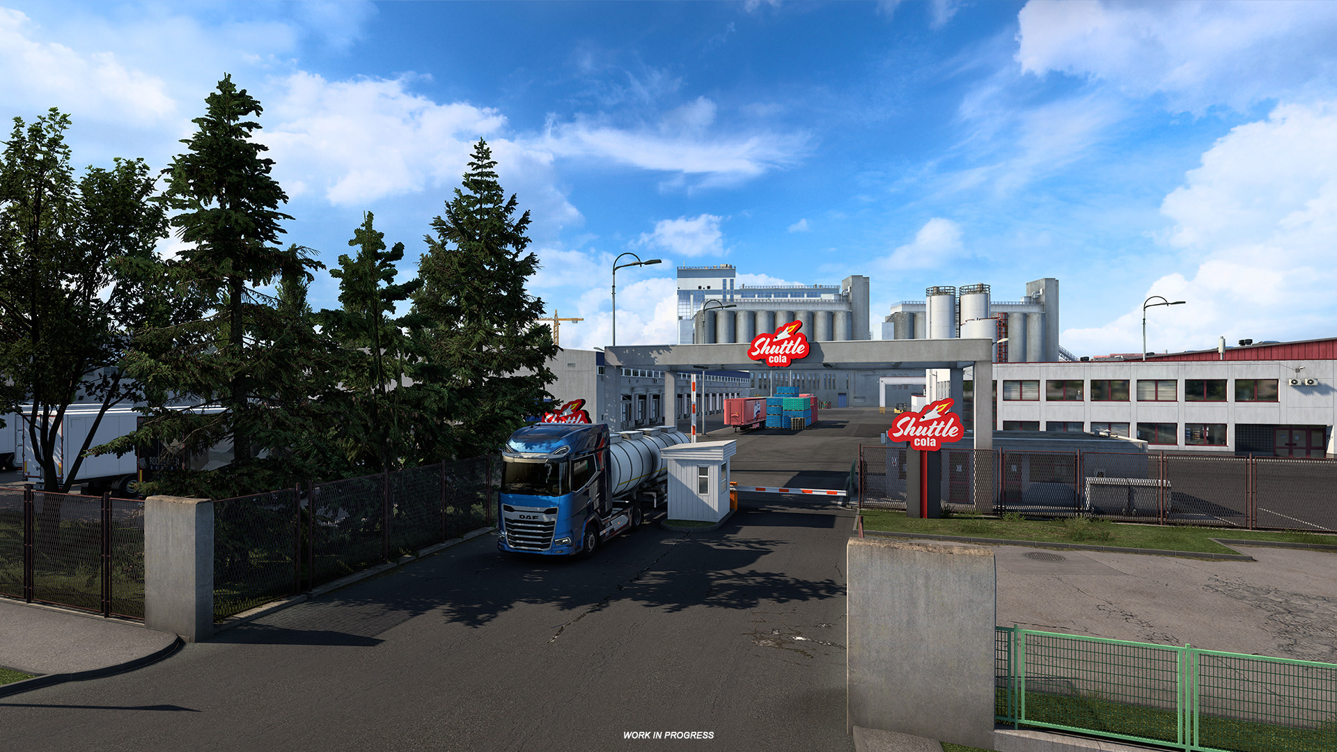
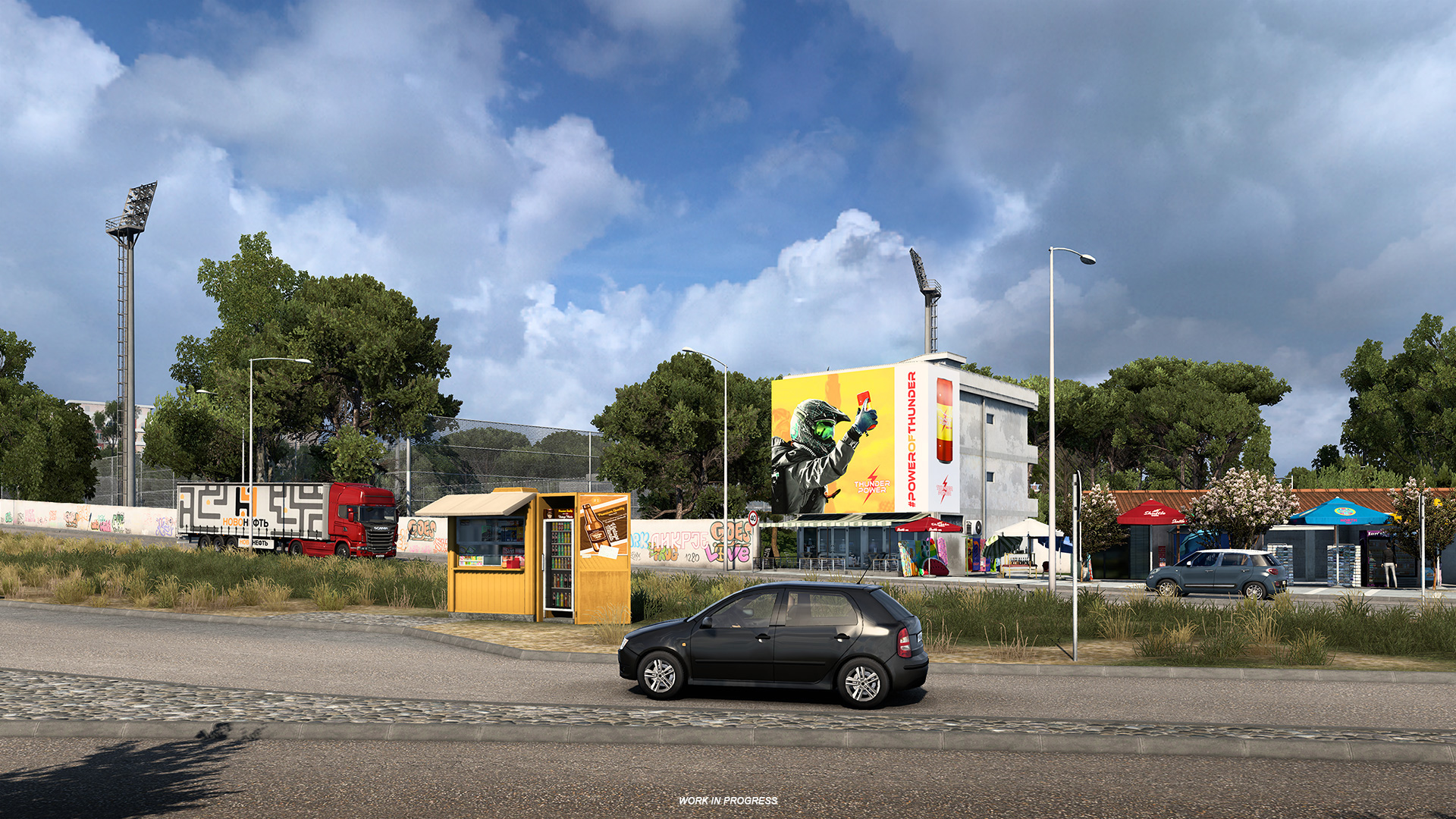
Shuttling Company - Shuttle Cola (Adel)
The idea of space came to me as a great concept to make the product more appealing to the American market. U thought that it would be a great idea to make an advert with an astronaut, drinking cola in orbit and longing for home. So I decided to use the space theme while creating the brand.
The main element of the logo features an illustrated space shuttle, symbolizing the nor-earth richness of flavor and the allure of the product. This element complements the overall concept of the space theme and adds visual interest.
To convey a touch of retro style, I used a font with nostalgic undertones, emphasizing the authenticity and cultural significance of the brand. This creates an association with classic colas and adds.
“Shuttle Cola" is my favorite brand that I created, I really enjoy using this brand in my works.


Light Industry - Eumefa (Adel)
When creating the logo for "Eumefa,” a company in the light industrial sector, I wanted to emphasize the industrial sphere and incorporate scientific motifs into the design. I came up with the idea of visualizing an atom or a crystalline lattice to convey a sense of scientific exploration and technological progress.


If you’d like to know more about Karina and Adel or the concept art at SCS in general, make sure to visit our Under the Hood blog post about this very topic. That being said, we can’t wait to show you more from the upcoming West Balkans DLC, so follow us on social media (Twitter, Instagram, Facebook, TikTok) to always stay in touch with all the latest news.
Please mind all the concepts are currently a "work in progress" and they might be different in the final version.
No comments:
Post a Comment
Spam, offensive, hateful and other inappropriate comments will be removed and authors may be permanently restricted from commenting.
Note: Only a member of this blog may post a comment.